 Verisutras
How to Map a Problem Before You Try to Solve It
A modern fighter jet can fly at Mach 2 to Mach 3, two to three times the speed of sound. A heat-seeking missile, once fired, is often faster still. The AIM-9 Sidewinder, the standard short-range air-to-air missile used across NATO air forces, travels above Mach 2.5, outrunning the aircraft that launched it.
In an engagement like that, a pilot has only a few seconds to observe the threat, make sense of it, decide what to do, and act. One misread, one hesitation, and the outcome isn’t a bad quarter. It’s a matter of life and death.
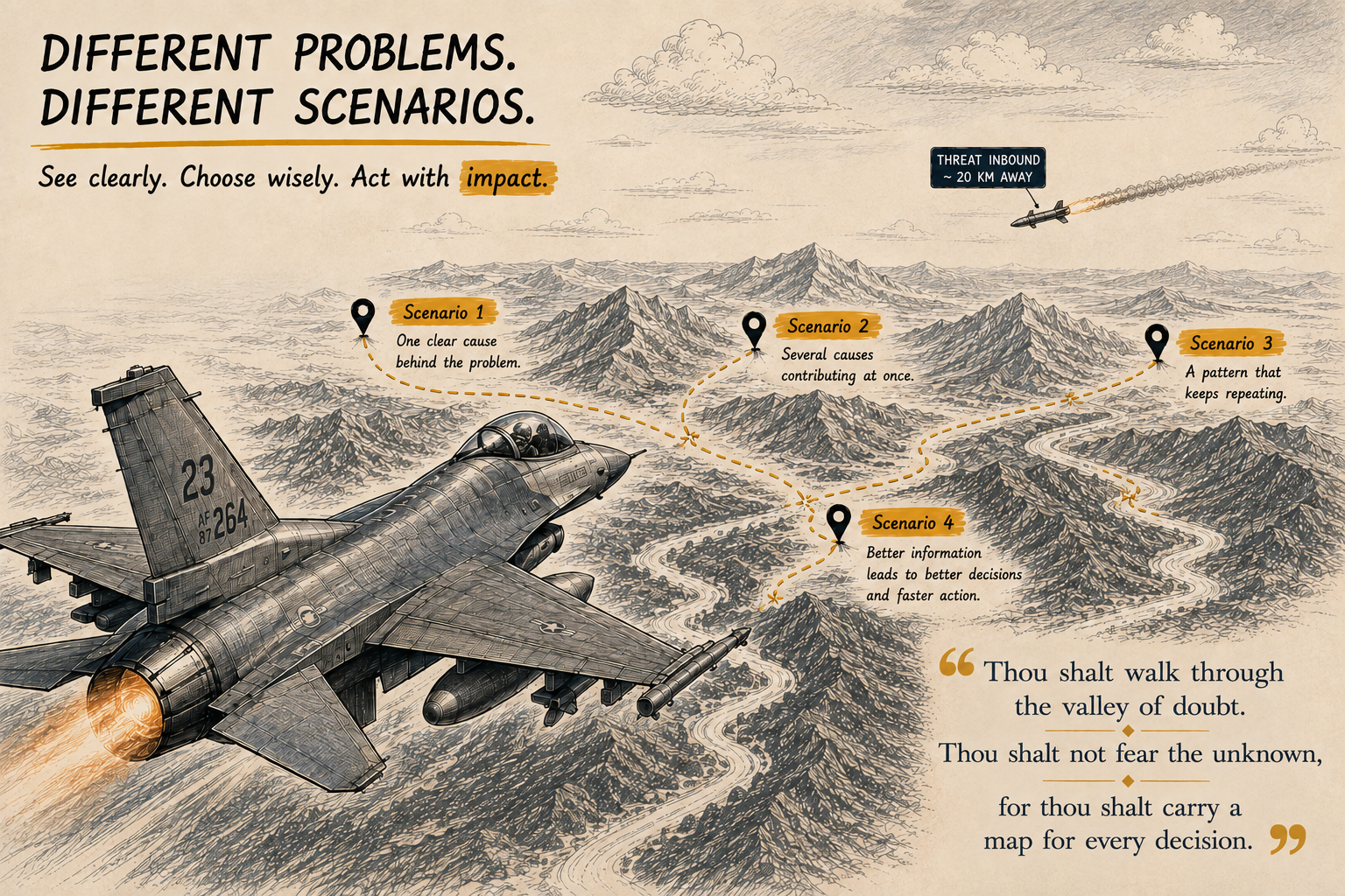
Before solving, understand the shape.
Most teams never face that kind of pressure. There is time to think, time to gather information, time to ask another question.
And yet many teams skip that thinking anyway. They jump straight from noticing a problem to choosing a solution. The step that gets skipped is understanding what the problem actually looks like.
A team notices that customer response times are getting worse.
Someone suggests hiring two more people. Someone else wants a new ticketing system. Within half an hour, everyone is discussing solutions.
Nobody has asked the simplest question: what exactly is happening?
That question sounds almost too obvious. In practice, it is one of the questions teams skip most often. We move quickly from a visible problem to an explanation, and from the explanation to a solution.
The missing step is usually the uncomfortable one: slowing down long enough to map the problem before deciding what it means.
The step most teams skip
Imagine an approval process that regularly takes eight days. The obvious response is to create a faster approval form.
But someone finally maps the process. Three departments are reviewing almost the same information. One department waits for another before starting its own review. A senior manager is signing off on decisions that could have been handled lower down.
The form was never the main problem. The process was.
This is why problem mapping matters. Different problems have different shapes. Sometimes there is a fairly clear chain of events leading to a failure. Sometimes several causes are operating at the same time. And sometimes a problem keeps returning because the system itself is helping to reproduce it.
Those situations need different ways of looking at them.
Why mapping deserves its own step
There is a useful distinction in operations research between solving a problem and structuring a problem. Jonathan Rosenhead’s work on problem structuring methods focused on situations where the problem itself may be unclear, contested, or understood differently by different people.
That describes a surprising amount of everyday organizational life.
A finance manager sees rising project costs as a budgeting problem. A project manager sees scope changes. Engineering sees rework. Sales sees customer commitments made before technical feasibility was understood.
They may all be describing the same situation. They are simply seeing different parts of it.
A map gives those different interpretations somewhere to meet. It doesn’t tell you who is right. It gives the team something concrete to question.
Three things happen when mapping gets skipped
The symptom becomes the target
A support team has long response times, so management hires more people. Response times improve. Three months later, they deteriorate again.
The extra staff treated the visible symptom without asking what was generating the workload.
Different people solve different versions of the problem
Marketing says the product launch failed because engineering delivered late. Engineering says the scope changed repeatedly. Design says nobody approved the final requirements.
All three statements may contain some truth. Without a shared picture, the meeting becomes an argument about whose explanation should win.
A map changes the conversation. Instead of asking “who is right,” the team can ask: “which of these factors actually contributed to the delay?”
The first plausible explanation becomes the answer
This is perhaps the easiest trap to fall into. An explanation sounds convincing, so the investigation stops. The team starts discussing the fix before it has established whether the explanation actually accounts for the problem.
Once everyone starts discussing the solution, questioning the original assumption becomes harder.
Seeing the problem before deciding what it means
The fighter pilot from the opening of this article wasn’t flying with today’s speed or missiles. In the early 1950s, before either existed in air combat, U.S. Air Force colonel John Boyd studied a slower fight: why F-86 Sabre pilots could perform so effectively against MiG-15 fighters during the Korean War.
The MiG-15 was a formidable aircraft. It could climb faster than the F-86, and its Klimov VK-1 engine gave it a service ceiling near 50,800 feet, several thousand feet higher than the Sabre could reach. Its cannon armament, two 23mm guns and one 37mm gun, hit harder than the Sabre’s six .50 caliber machine guns. At high altitude, the MiG was often faster too.
On paper, the F-86 should have lost more often than it won.
It didn’t. American pilots were officially credited with roughly ten MiG-15 kills for every Sabre lost. Later analysis of Soviet-era records suggests the real ratio was smaller, closer to two or three to one. The exact ratio remains debated.
The more interesting point is why Boyd believed the Sabre had an advantage. His explanation had less to do with raw aircraft performance and more to do with what a pilot could actually do with what he saw.
The F-86’s bubble canopy gave the pilot a wider field of view than the MiG-15’s framed canopy. Hydraulically boosted controls allowed Sabre pilots to roll and reverse direction more quickly, particularly at high speed, when the MiG’s manual controls became heavy. A G-suit also helped Sabre pilots sustain hard turns without blacking out.
None of those advantages tell the whole story on a specification chart. But they affected the time between seeing something, understanding it, and doing something useful about it. That gap became central to Boyd’s thinking.
Boyd later formalized the idea into the OODA loop: Observe, Orient, Decide, Act.
The concept came from combat aviation. The underlying idea works in much quieter environments too, a project review, for example.
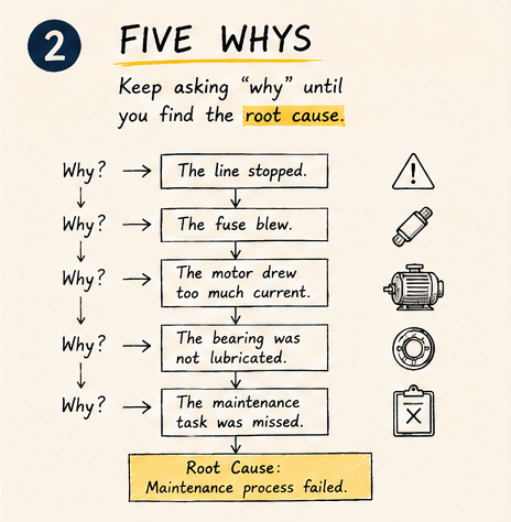
Follow the chain.
Three ways to map a problem
There are three methods worth knowing. Five Whys follows a causal chain. Fishbone opens a problem up into multiple possible causes. Causal loop diagrams look for feedback that keeps a problem alive.
The choice becomes easier once you stop asking which method is best and start asking what shape the problem has.
1. Five Whys
Five Whys is associated with the Toyota Production System and is described in the work of Taiichi Ohno.
The basic idea is simple. Start with an observed problem and repeatedly ask why, following the causal chain until you reach something that can be acted upon.
Consider a machine that suddenly stops.
The line stopped. Why? The fuse blew.
Why? The motor drew excessive current.
Why? A bearing created excessive resistance.
Why? The bearing had not been lubricated.
Why? The scheduled maintenance task was missed.
The investigation has moved from the blown fuse to a maintenance failure. That is where Five Whys is useful. It helps you follow the path rather than stopping at the first visible failure.
When Five Whys works
Use it when the event is relatively contained, the sequence is reasonably clear, there appears to be a dominant causal chain, and you have enough evidence to follow that chain.
But don’t treat five as a magic number. Sometimes the useful answer appears after three questions. Sometimes you need seven. The purpose is to keep following the evidence, not to complete a ritual.
Where Five Whys breaks down
Suppose customer complaints are increasing.
Why? Response times are slow. Why? The support team is overloaded. Why? There are too many tickets.
Now the problem branches. Perhaps the product is difficult to use. Perhaps customers are submitting duplicate tickets. Perhaps a recent policy change encouraged more customers to contact support. Perhaps all three are happening.
A single chain of whys can hide that complexity. That’s when another map becomes more useful.
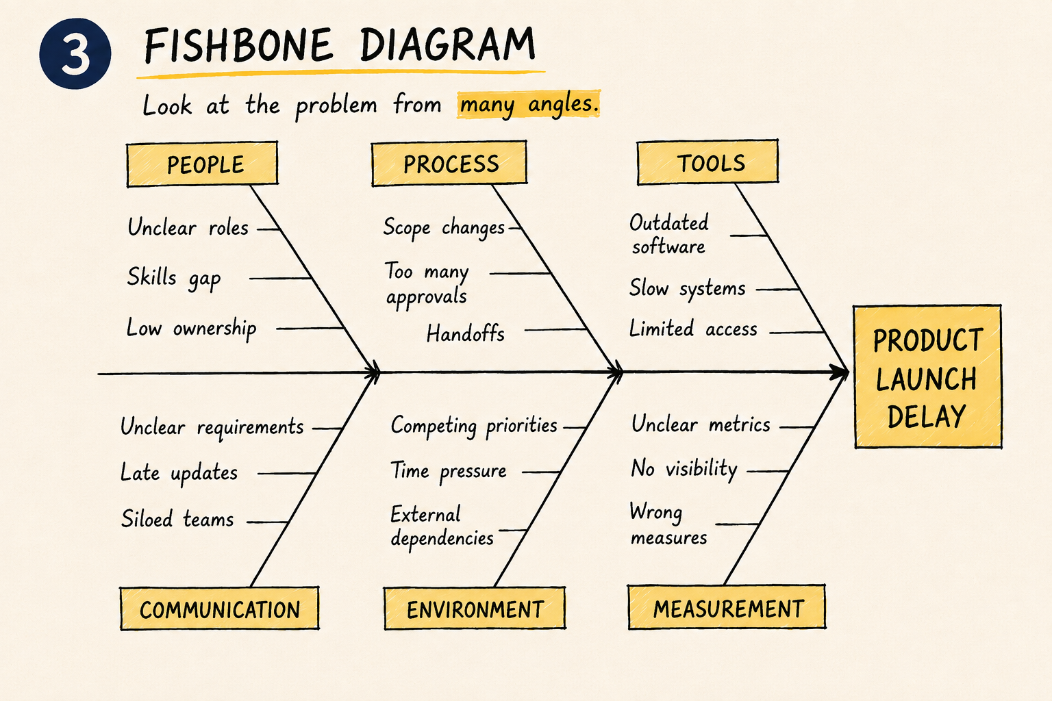
Open the problem before narrowing it.
2. Fishbone: open the problem up
A fishbone diagram, also called an Ishikawa or cause-and-effect diagram, is designed for situations where several categories of causes could be contributing to one outcome.
The problem sits at one end. Possible causes branch away from it. Those branches might represent people, process, technology, materials, measurement, or environment. The categories can change depending on the situation.
The value of the fishbone is not the shape of the drawing. It is the permission it gives a team to consider several explanations before choosing one.
A product launch goes wrong
Imagine a product launch that misses its deadline. Marketing blames late assets. Engineering blames scope changes. Design blames unclear requirements. Product management blames slow decisions.
Instead of choosing one explanation, put all four on the same map. Then ask which ones have evidence behind them.
The conversation changes. It stops being “whose fault was it” and becomes “which of these factors actually contributed to the delay.” That is a much better question.
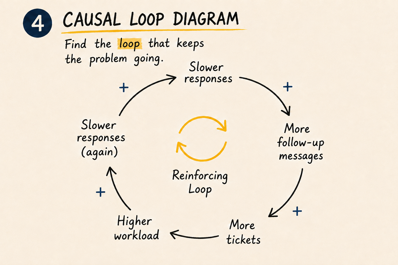
Some problems keep creating themselves.
3. Causal loop diagram: find what keeps coming back
Some problems behave differently. You fix them. They return. You add resources. They return. You introduce a new policy. The problem appears somewhere else.
That pattern should make you suspicious of a single root cause. You may be looking at a feedback loop.
Causal loop diagrams come from the broader field of system dynamics, associated with Jay Forrester and later made accessible to a much wider audience through systems-thinking writers such as Donella Meadows.
The question changes from “what caused this” to “what keeps this happening.”
The support problem that feeds itself
Imagine a support team with rising response times. Customers wait longer. They send follow-up messages. Those follow-ups create additional tickets. The ticket queue grows. The team becomes more overloaded. Response times increase again.
You now have a loop: slower responses lead to more follow-ups, which create more tickets, which raise workload, which slows responses further.
Adding another person might help. But if the loop remains, the organization may eventually find itself back in the same place. This is why recurring problems deserve a different kind of investigation.
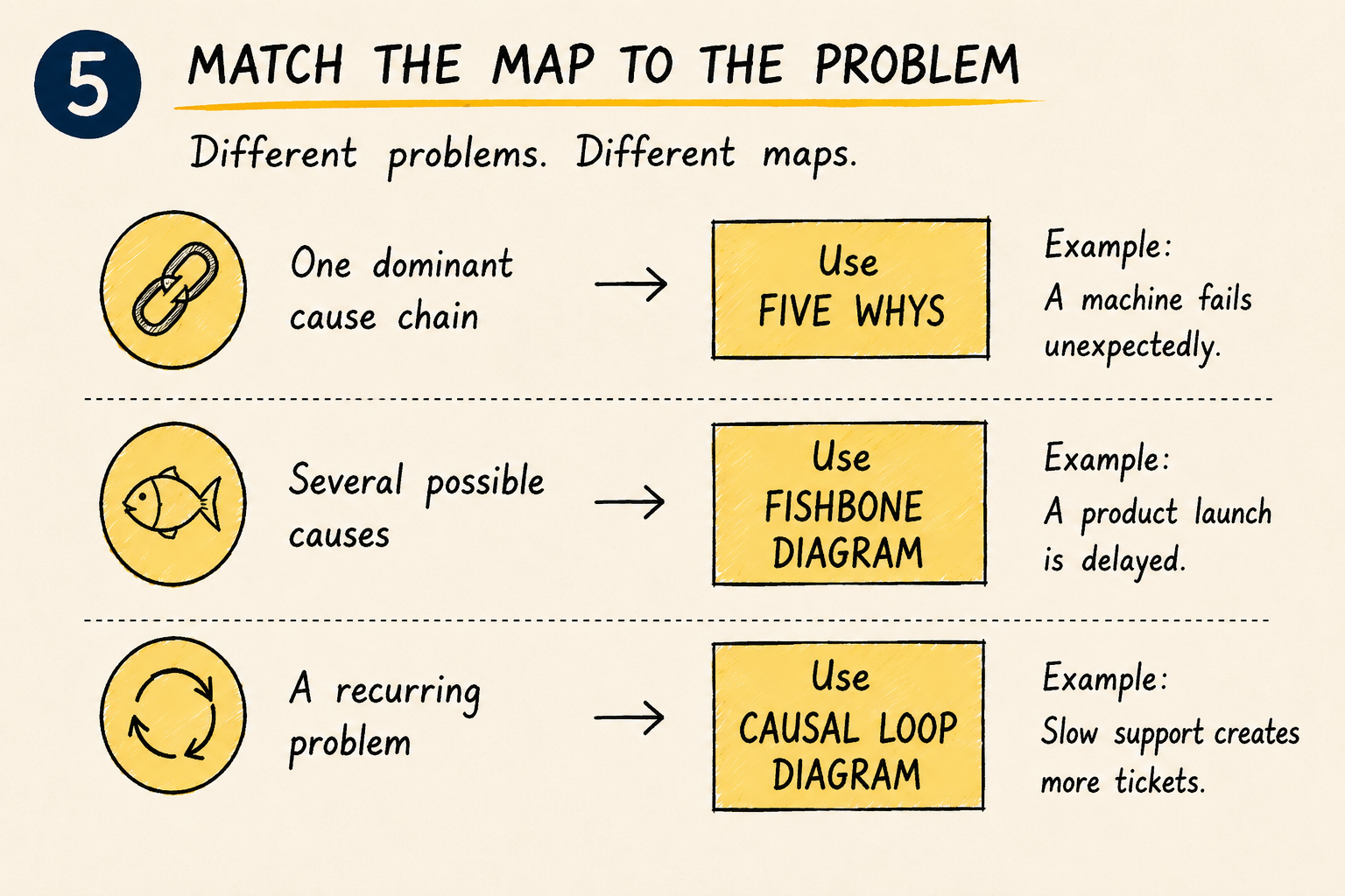
Match the map to the problem.
How to choose the right map
You don’t need a complicated diagnostic system. Start with the shape of the problem.
One dominant causal chain: use Five Whys. Example: a machine fails unexpectedly and the sequence leading to the failure can be traced.
Several plausible causes: use a fishbone diagram. Example: a product launch misses its deadline and different departments have different explanations.
A recurring problem: use a causal loop diagram. Example: slow support creates more tickets, which makes support slower.
That’s the basic decision rule.
You can use them together
These methods don’t have to compete. Imagine a company dealing with a growing number of customer complaints.
Start with a fishbone. The team identifies several possible contributors: product defects, confusing documentation, slow support, training gaps, billing problems, poor communication.
One branch, support response time, looks particularly important. Now use Five Whys to investigate that branch. The team discovers that agents spend large amounts of time searching for information.
But another question remains. Why has the problem become worse over the past year? A causal loop diagram reveals something else: slower support creates more follow-up tickets, more tickets create more workload, more workload makes support slower.
Now the team has three views of the same problem. Fishbone opened it. Five Whys traced it. The causal loop explained why it persisted. That is often more useful than forcing every problem through one method.
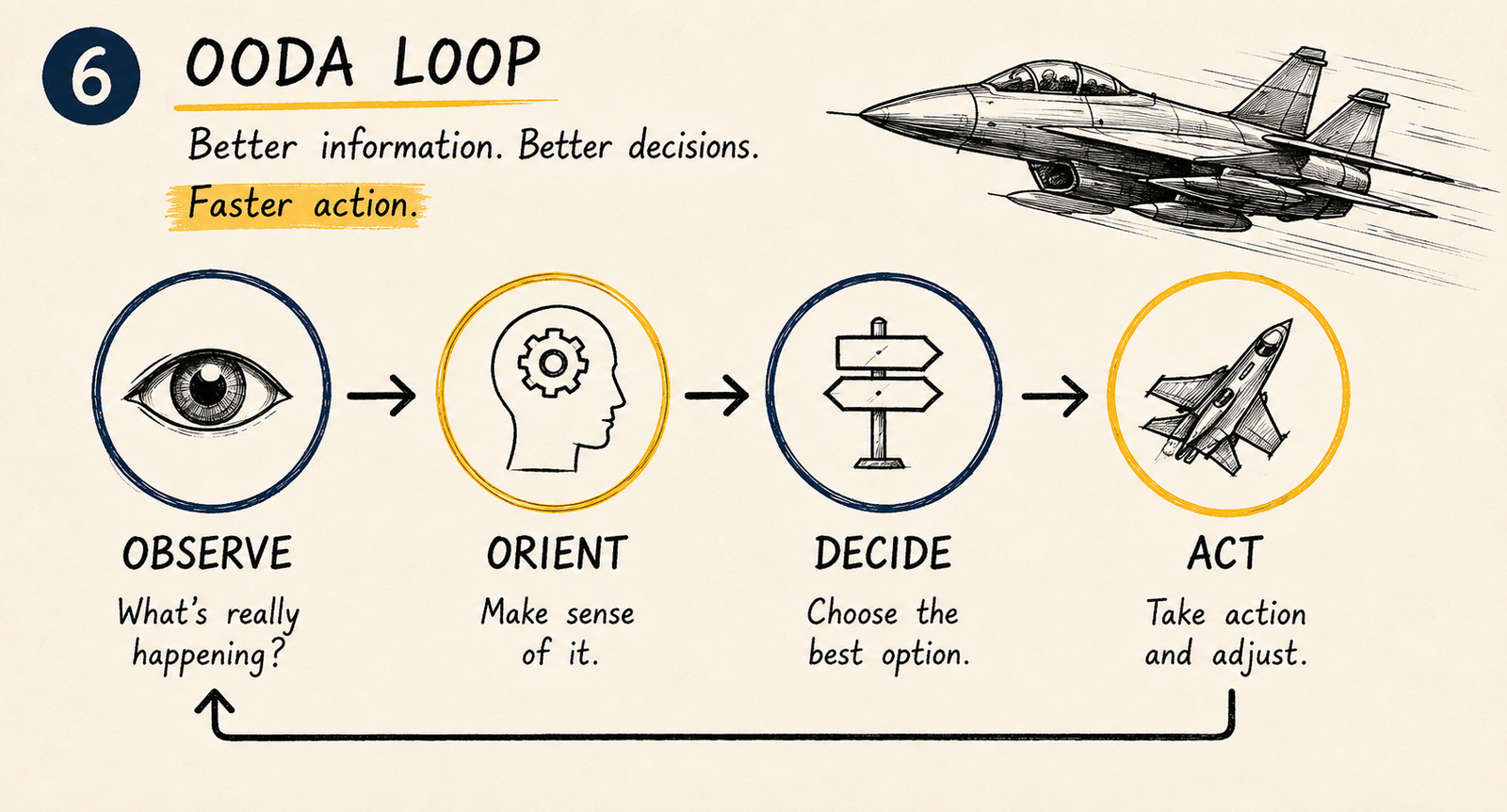
Better information leads to better decisions.
The map should change the conversation
There is one rule worth keeping in mind.
A weak problem statement sounds like this: “our customer service is terrible.”
A better one is: “average first-response time increased from four hours to eleven hours over the past six months.”
The second statement gives the team something to investigate. It also creates a useful separation between what is known and what is assumed.
You know response time increased. You may believe understaffing caused it. You may still need to determine whether staffing, ticket volume, workflow, product defects, or something else explains the increase. That distinction matters.
Don’t become attached to the map
A problem map can create its own illusion of certainty. A team draws a beautiful fishbone. Everyone feels productive. The problem appears understood. It may not be.
Ask what evidence supports this connection, what evidence contradicts it, what are we assuming, what have we left out, and what would we expect to observe if this explanation were correct.
That last question is especially useful. A good map should lead to something you can check.
Before your next problem-solving meeting
Try this sequence.
1. State the observable problem
Describe what is happening without explaining why.
2. Decide the shape
Is this one chain, several possible causes, or a recurring pattern?
3. Map before debating
Capture the possibilities before deciding which one is right.
4. Mark assumptions
Put a question mark beside anything that has not been verified.
5. Find the strongest connection
Look for the relationship that appears important and has enough evidence to investigate.
6. Ask what would change your mind
If your explanation is wrong, what would you expect to see?
7. Only then discuss solutions
The solution should follow the map, not create it.
The question worth asking
Walk into almost any project review and you’ll hear familiar questions. What’s the budget? Are we on schedule? Can we launch this quarter?
All of them matter. One question is often missing.
That question forces the team to think beyond the immediate result. It doesn’t require predicting the future. It requires considering what happens after the decision changes the system.
A decision rarely ends when the meeting ends. Sometimes that is where its second-order effects begin.
The bigger lesson
Organizations are rewarded for action. A problem is identified. A project starts. A budget is approved. A solution is launched. It feels like progress. Sometimes it is.
Sometimes the organization has simply become very efficient at solving the wrong problem.
Problem mapping introduces a small amount of friction before action. That friction is useful. It gives people time to separate symptoms from causes, facts from assumptions, and isolated events from recurring patterns.
Five Whys helps when the path is relatively narrow. Fishbone helps when the problem needs to be opened up. Causal loop diagrams help when the system itself may be reproducing the behavior you are trying to eliminate.
The important question isn’t which problem-solving tool should we use. It is what kind of problem are we looking at. Once you can answer that, the tool becomes much easier to choose.
And sometimes the map reveals something more valuable. The problem you thought you needed to solve isn’t actually the problem you have.
Before you solve your next problem
Ask seven questions.
- What problem are we actually seeing?
- What do we know, and what are we assuming?
- Is there one causal chain or several?
- Does the problem keep returning?
- Who sees the problem differently?
- What evidence would prove our explanation wrong?
- What happens if our solution works exactly as intended?
A good problem map won’t guarantee a good decision. It does something more practical. It gives you a better chance of solving the problem that actually exists.
References
1. Rosenhead, J. (1989). Rational Analysis for a Problematic World: Problem Structuring Methods for Complexity, Uncertainty and Conflict. Wiley. Author profile: LSE
2. Ohno, T. (1988). Toyota Production System: Beyond Large-Scale Production. Productivity Press. Author profile: Britannica
3. Ishikawa, K. Guide to Quality Control. Japanese Standards Association. Author profile: ASQ
4. Meadows, D. H. (2008). Thinking in Systems: A Primer. Chelsea Green Publishing. Author profile: The Donella Meadows Project
5. Forrester, J. W. (1961). Industrial Dynamics. MIT Press. Author profile: MIT Sloan
6. Coram, R. (2002). Boyd: The Fighter Pilot Who Changed the Art of War. Little, Brown and Company. Subject profile: The Boyd Institute
7. Rosenhead, J. (2013). “Problem Structuring Methods.” Encyclopedia of Operations Research and Management Science. Springer.
8. AIM-9 Sidewinder. U.S. Air Force Fact Sheet. Department of the Air Force.
9. Napier, M. (2021). Korean Air War: Sabres, MiGs and Meteors, 1950–53. Osprey Publishing. Author interview